github 주소 : github.com/sangHa0411/DataScience/blob/main/Amazon_BestSellers_Seaborn.ipynb
sangHa0411/DataScience
Contribute to sangHa0411/DataScience development by creating an account on GitHub.
github.com
아래는 Heatmap에 대한 참고자료에 대한 내용입니다.
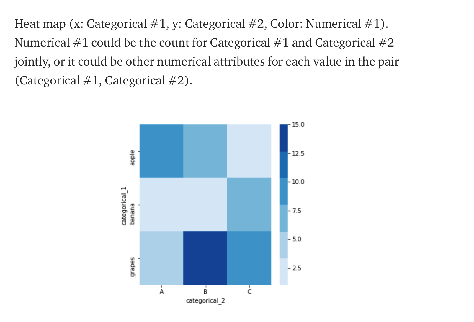
x , y 모두 이산적인 속성으로 정하고 색깔을 연속적인 속성으로 정함으로써 어디 칸의 색깔이 가장 짙은지를 혹은 색깔이 옅은지를 쉽게 파악할 수 있습니다.
seaborn 을 이용한 데이터 시각화 방법 : electronicprogrammers.com/71?category=904280
Python - Seaborn을 이용해서 데이터 시각화하는 방법
github 주소 : github.com/sangHa0411/DataScience/blob/main/Amazon_BestSellers_Seaborn.ipynb sangHa0411/DataScience Contribute to sangHa0411/DataScience development by creating an account on GitHub. g..
electronicprogrammers.com
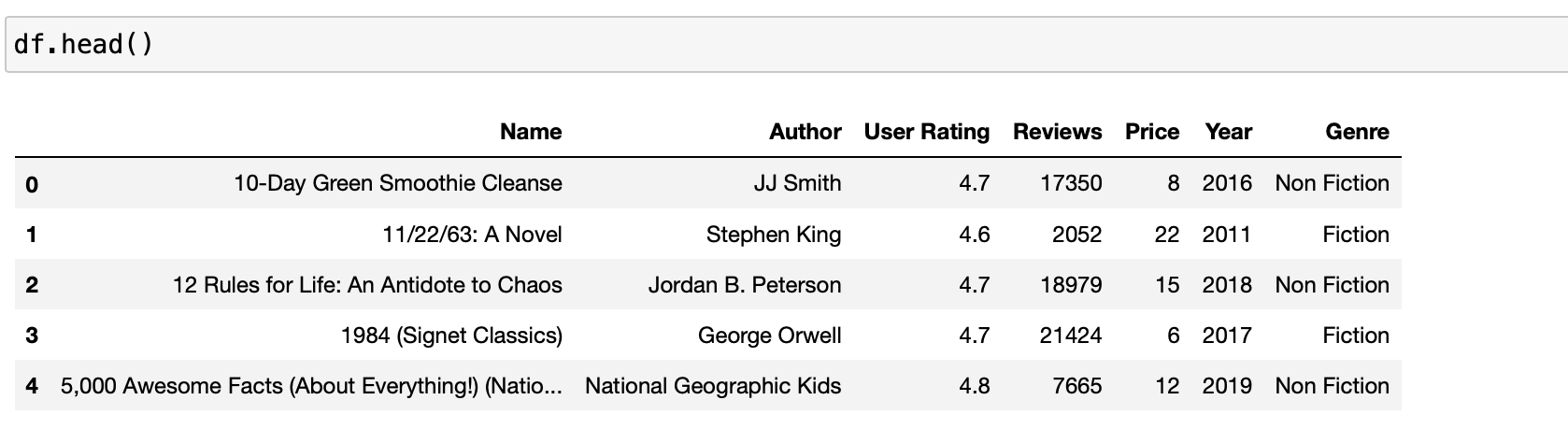
하지만 이전 포스팅에서는 .csv 파일을 Pandas를 이용해서 불러온 데이터를 그대로 seaborn 함수에 입력했으면 됬지만 heatmap으로 시각화하기 위해서는 전처리가 필요합니다.
먼저 데이터 구조를 확인해보겠습니다.
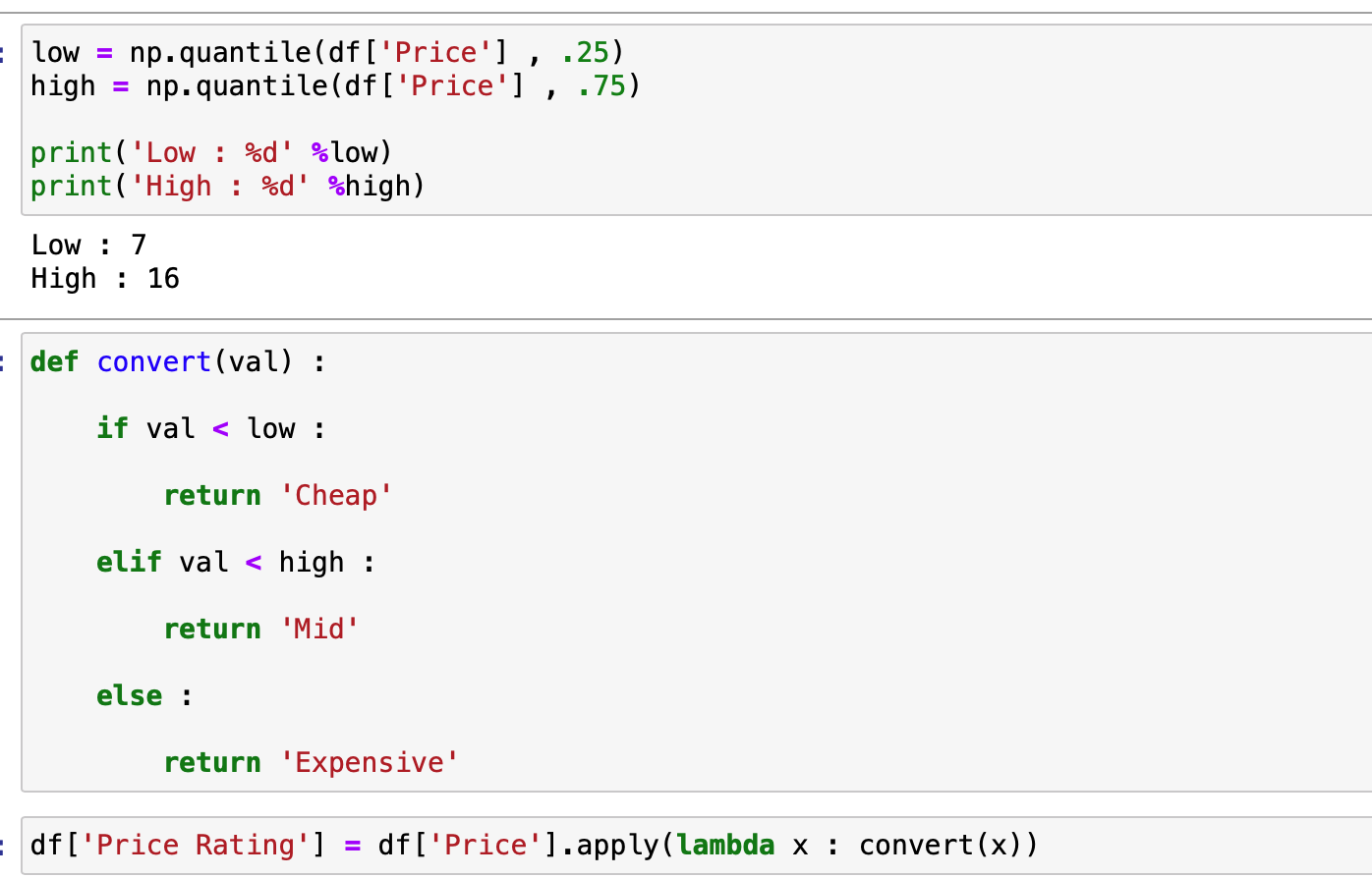
여기서 x, , y 모두 이산적인 속성에 대해서 다루어야 하므로 연속적인 속성인 가격에 대해서 이산적인 속성으로 변경하도록 하겠습니다.
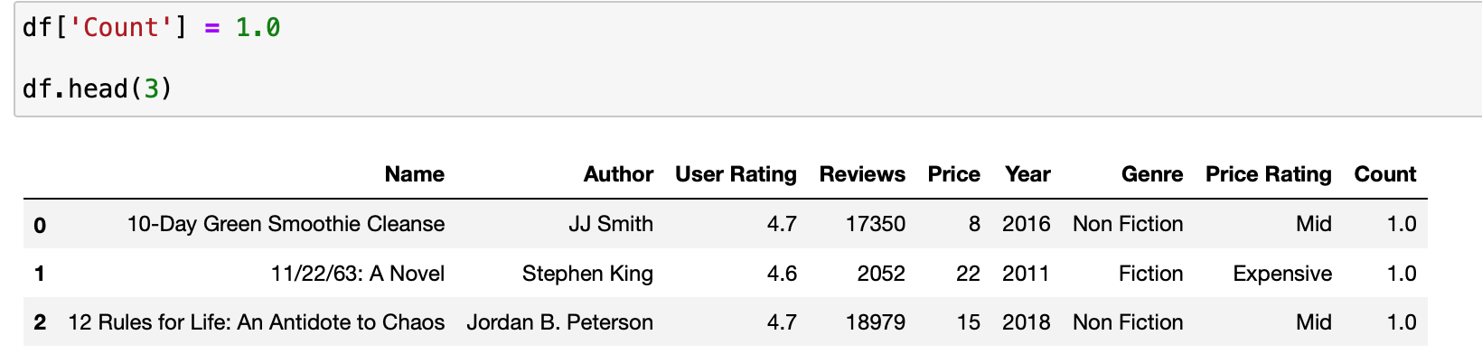
이제 색깔을 정할 연속적인 속성을 하나 정해야 하므로 갯수를 의미할 'Count' 속성을 하나 추가하도록 하겠습니다.
이제 본격적인 데이터 전처리를 하고 과정을 정리해보도록 하겠습니다.
df.groupby(['Year' , 'Price Rating']).sum()['Count']
Pandas의 groupby 함수를 이용해서 위와 같은 구조를 활용해서 전처리를 진행할 계획입니다.
year_price_Grouped = df.groupby(['Year' , 'Price Rating']).sum()['Count']

year_price_Grouped = pd.DataFrame(year_price_Grouped)

year_price_Grouped.head()
위에서 만든 year_price_Grouped 또한 Pandas의 DataFrame이며 이 DataFrame의 인덱스는 다음과 같습니다.
indexes = year_price_Grouped.index

print(indexes[:5])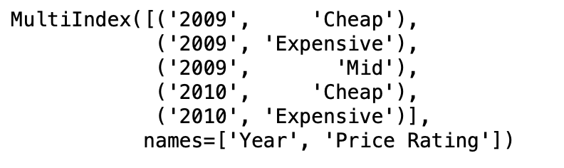
이제 sns.heatmap에 인자로 넣을 DataFrame을 만들어보겠습니다.
heatmap = pd.DataFrame(columns=['Year', 'Price Rating', 'Counts'])

heatmap.head()
'Year' , 'Price Rating' 는 x , y 에 들어갈 이산적인 속성을 의미하고 Counts는 각 x, y 속성에 해당하는 데이터의 갯수를 저장할 연속적인 속성을 의미합니다.
for i in range(len(indexes)) :

    index = indexes[i]

    heatmap.loc[i , 'Year'] = index[0]
    heatmap.loc[i , 'Price Rating'] = index[1]

    val = year_price_Grouped.loc[index][0]

    heatmap.loc[i , 'Counts'] = int(val)


heatmap.head()
여기서 주의할 것은 위 DataFrame의 속성이 object 이기 때문에 이를 int 혹은 float으로 변경해주어야 합니다.
heatmap.dtypes
heatmap['Counts'] = heatmap['Counts'].apply(lambda x : int(x))

heatmap.dtypes
이제 이 DataFrame의 pivot 함수를 이용해서 DataFrame의 구조를 변경해보도록 하겠습니다.
heatmap = heatmap.pivot('Year' , 'Price Rating' , 'Counts')

heatmap.head()
이제 최종적으로 Heatmap을 만들 전처리가 완료되었습니다.
plt.figure(figsize = (10 , 6))

plt.title('Year , Price Heatmap' , fontsize = 20)

ax = sns.heatmap(heatmap , cmap = 'BuPu')

plt.ylabel('Year' , fontsize = 15)
plt.xlabel('Price Rating' , fontsize = 15)

plt.show()
색깔의 농도는 해당 속성의 데이터 갯수를 의미하므로 확실히 Mid 속성의 색깔이 다른 속성에 비해서 색깔이 짙은 것을 확인할 수 있습니다.
A step-by-step guide for creating advanced Python data visualizations with Seaborn / Matplotlib
Although there’re tons of cool visualization tools in Python, Matplotlib + Seaborn still stands out for its capability to create and…
towardsdatascience.com
'Python' 카테고리의 다른 글
| Python - WordCloud 만들고 시각화하기 (0) | 2020.11.07 |
|---|---|
| Python - Plotly를 이용해서 데이터 시각화하는 방법 (0) | 2020.11.06 |
| Python - Seaborn을 이용해서 데이터 시각화하는 방법 (0) | 2020.11.05 |
| Python - Matplotlib을 이용해서 데이터 시각화 하는 방법 (0) | 2020.11.05 |
| Python - 기존 그래프의 확대 부분 같이 그리기 (1) | 2020.11.01 |